Sometimes, I don't understand why teachers choose certain fonts. I understand that they want legible, easy to read, and simple fonts. But I can't comprehend why they would only accept certain fonts. I can understand why they wouldn't want some super strange cursive-scribble-like font. But I can't understand why they won't allow legible fonts, other than Arial and Times New Roman, to be used on papers. (At least, for my teachers.). Personally, I don't really like the fonts, Arial and Times New Roman. I just think that they look hideous. o_o.
One of my favorite fonts is Calibri (Body). And I like using it when it's size 11. When I'm not typing up a paper that I have to turn in to a teacher, I use that font. To me, it looks nice. It's a simple font and it's really easy to read. I think teachers should allow Calibri (Body) to be used on essays and whatnot. :o. Let's a start a movement to get teachers to allow more fonts to be used! :D. (Or not. ._.). But in all seriousness, it would be nice if teachers allowed more fonts to be used on papers that are supposed to be turned in. However, sometimes, the same fonts look different on different word processing programs and computers. o_o. I find that strange. ._. Universal look, ftw? :x.
Note: I'm just talking about teachers in general. There are some teachers that allow a variety of fonts to be used. Lool.
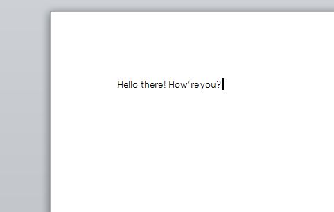
Calibri (Body). Size 11. | v.s. | 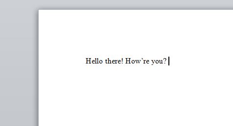
Times New Roman. Size 12. |
Note: Click the pictures to see larger and clearer versions of them.
So, you be the judge. Tell me which one looks better to you. (Your opinion matters! :D.). Feel free to share your significant opinion by commenting in the Comments section below!
So, you be the judge. Tell me which one looks better to you. (Your opinion matters! :D.). Feel free to share your significant opinion by commenting in the Comments section below!
 RSS Feed